A Primer on Editorial Design
编辑设计入门
Fifteen principles that editorial designers have agreed on for a hundred years — beginner-friendly, canon-sourced, and demonstrated on the page.
一百年来编辑设计师们反复确认的十五条原则——入门友好、溯源经典,并在本页亲自示范。
Editorial design is the craft of shaping text and image into something a reader wants to stay with. It predates the web by five centuries and predates the printed book by several more. Across letterpress, phototypesetting, desktop publishing, and the browser, a small number of principles have kept turning up in the work of careful designers — because each one solves a specific, recurring problem a reader faces.
编辑设计这门手艺,做的是一件事:把文字和图像整合成读者愿意停下来、读完的东西。它比万维网早五个世纪,比印刷书更早几百年。从活字印刷到照排、从桌面排版再到浏览器,用心的设计师们翻来覆去发现的,就是那么几条屡试不爽的原则——因为每一条都对应着读者面前具体、反复出现的问题。
This Primer distills thirteen of those principles, arranged in three tiers. Reading covers how the eye consumes text. Composition covers how the page is built. System covers how coherence is maintained across many surfaces, many themes, many languages. Each principle is stated plainly, explained briefly, traced to its source, and shown on the page.
本入门篇把其中十三条原则归为三层。阅读层讲眼睛如何消化文字;构图层讲页面如何搭建;体系层讲多页面、多主题、多语言之间如何保持一致。每一条都直白陈述、简要解释、溯源经典,并在本页亲自演示。
Every visual in this Primer is built from the same design system the site itself uses. Nothing here is bespoke. If a principle needs a demonstration, the demonstration is made of the exact tokens, components, and rules the principle itself recommends. The Primer practices what it teaches.
本篇所有视觉示范都使用本站同一套设计系统,没有一处是为这一篇特制的。原则需要示范时,示范用的就是这条原则自己推荐的 token、组件和规则。换句话说,本篇的教法与做法一致。
If you are new to editorial design, read it in order. If you already know the canon, use it as a reference — every principle stands on its own.
如果你是新手,按顺序读下去即可。如果经典已经读过,就把它当参考书用——每条原则都能独立成立。
👁️ Tier 1 — Reading
👁️ 第一层 —— 阅读
How the eye consumes text. These are the principles that determine whether a reader reaches the end of a paragraph or skims and leaves. They trace most directly to Bringhurst and to the practical web writing of Matthew Butterick.
眼睛如何消化文字。这几条决定读者是把一段读完,还是扫两眼就走。最直接可以追溯到 Bringhurst,以及 Matthew Butterick 在网络写作上的实践。
Measure is reading
行宽就是阅读
Rule. Line length belongs in the 45–75 character range.
规则。一行文字的宽度应落在 45–75 个字符之间。
A line that is too short makes the eye jump back too often; the rhythm of reading fragments. A line that is too long loses the return — after the eye sweeps back to the left margin, it has trouble finding the next line. Both failures interrupt the reader without the reader knowing why. The 45–75 character target is the range where the eye stays in rhythm and the text feels like reading rather than scanning.
太短的行让眼睛频繁回跳,阅读节奏就碎掉了;太长的行让眼睛在扫回左边界之后找不到下一行。两种毛病都会打断读者,而读者自己说不出哪儿别扭。45–75 字符这个区间,是眼睛节奏稳定、文字感觉像"阅读"而不是"扫视"的甜点区。
Origin. Bringhurst, The Elements of Typographic Style, §2.1.3 ("Choose a comfortable measure").
源出。Bringhurst《字体排印风格的要素》§2.1.3("选一个舒适的行宽")。
Newspapers of record sometimes publish investigative journalism at a line length that sprawls well past the comfort zone — by the time the eye sweeps back from the right margin it has trouble finding the next line. The reader feels it as mild fatigue, then as impatience, and never quite names what went wrong. The text is simply too wide to stay in rhythm, so reading turns into scanning.
有的报纸把深度报道排到接近一百字符的宽度——眼睛扫到右边再回到左边时,经常找不到下一行的起点。读者先是感到轻微的疲劳,接着是不耐烦,却说不上哪儿别扭。其实就是行太宽了,阅读的节奏被撑散,只剩下扫视。
The same sentence, set at a measure that lands inside Bringhurst's 45–75 character target. The eye stays in rhythm.
同一句话,宽度落在 Bringhurst 的 45–75 字符区间内,眼睛的节奏就稳住了。
Go deeper. Bringhurst §2.1.3–2.1.4. Butterick, Practical Typography, "Line length." · In our DS: §1 Measure is reading
深入阅读。Bringhurst §2.1.3–2.1.4;Butterick《实用字体排印》"Line length"。 · 对应规范: §1 Measure is reading
Hierarchy through decoration, not size
用修饰而非字号来制造层级
Rule. Use one body size. Emphasis comes from weight, italic, small caps, rule, background, space — never from a larger font.
规则。正文只用一种字号。强调靠粗细、斜体、小型大写、线条、底色、留白——不靠字号放大。
Mixed prose sizes read as marketing. A page where every paragraph is a different size has no hierarchy at all — the eye can't tell signal from noise. Editorial discipline is one body size plus varied decoration: bold for the term being defined, italic for titles, small caps for structural markers, indentation for block quotes, a thin rule to announce a new section. The variation carries the hierarchy; the size stays constant.
段落字号一变再变,读上去就成了落地页推销文案——没有层级,只有噪音,眼睛分不出主次。编辑设计的自律是:正文只用一种字号,用粗细、斜体、小型大写、缩进、细线、底色去承担层级。变化的是修饰,字号保持不变。
Origin. Bringhurst §3, on typographic hierarchy. Tschichold's restraint (Designing Books).
源出。Bringhurst §3 关于字体层级;Tschichold 晚年《书籍设计》中的克制。
Bold — carries terminological weight.
Italic — signals a title or a voice shift.
Small caps — announce a structural marker.
Rule — pulls the eye to a section break.
Indent — sets a block apart without shouting.
Kicker — a centered hint, set in all caps.
Go deeper. Lupton, Thinking With Type, chapter on hierarchy. Butterick, "Bold or italic." · In our DS: §2 Hierarchy via decoration
深入阅读。Lupton《Thinking With Type》"Hierarchy" 章;Butterick "Bold or italic"。 · 对应规范: §2 Hierarchy via decoration
Vertical rhythm
纵向节奏
Rule. Spacing between blocks comes from a small discrete scale, and siblings share rhythm.
规则。块与块之间的间距取自一套小而离散的刻度;兄弟级元素共享同一节奏。
When every margin is hand-chosen, the page jitters. Readers don't know why, but they feel it. The Swiss tradition named this: vertical rhythm is the baseline grid that every element lands on. In modern CSS the equivalent is a fixed spacing scale. Siblings that share a rhythm read as siblings; siblings with bespoke margins read as strangers.
每一个外边距都手调一下,页面就会"抖"。读者说不出哪儿不对,但体感很明确。瑞士传统给这件事起过名字——纵向节奏,即所有元素共同落在一条基线网格上。在现代 CSS 里,对应的是一套固定的 spacing token。共享节奏的兄弟元素读上去是一家人,各调各的读上去就是陌生人。
Origin. Müller-Brockmann, Grid Systems in Graphic Design.
源出。Müller-Brockmann《平面设计中的网格系统》。
First paragraph — margin 4px.
第一段 —— 外边距 4px。
Second paragraph — margin 32px.
第二段 —— 外边距 32px。
Third paragraph — margin 14px.
第三段 —— 外边距 14px。
First paragraph — --space-md.
第一段 —— --space-md。
Second paragraph — --space-md.
第二段 —— --space-md。
Third paragraph — --space-md.
第三段 —— --space-md。
Go deeper. Müller-Brockmann, Grid Systems, first three chapters. Lupton, "Grid" chapter. · In our DS: §3 Rhythm is a closed set
深入阅读。Müller-Brockmann《Grid Systems》前三章;Lupton "Grid" 章。 · 对应规范: §3 Rhythm is a closed set
Alignment follows content
对齐方式随内容类型而定
Rule. Prose is flush-left ragged-right. Display type may be centered. Never center multi-line prose.
规则。正文左对齐、右侧自然参差;展示性字体(标题、单行元素)可以居中。多行正文绝不居中。
Centered multi-line paragraphs produce a jagged right edge on every line. The reader's eye has to re-find the start of each line, and the rag distracts from the words. Flush-left ragged-right keeps the left margin vertical and allows the right to breathe naturally. Centering belongs to display — a hero title, a short caption, an epigraph — where the form is legible at a glance and the symmetry adds ceremony.
多行正文居中,每一行右侧都是参差不齐的锯齿,读者的眼睛每一行都得重新定位起点,锯齿本身又在抢注意力。左对齐、右侧自然参差,左侧是条稳定的"立轨",右侧则自由呼吸。居中属于展示性元素——主标题、单行题注、题铭——那种一眼扫过就读完、对称能增添仪式感的地方。
Origin. Bringhurst §3.2 on rag. Editorial convention going back to letterpress.
源出。Bringhurst §3.2 关于右侧参差;编辑传统可追溯到活字印刷时代。
A four-line paragraph set centered produces a visibly jagged right edge on every line. The reader's eye has to re-find the start of each line.
一段四行文字居中排布,每一行右侧都参差不齐;读者眼睛必须一次次重新定位下一行的起点。
The same paragraph flush-left has a stable left rail the eye can return to, with a natural rag on the right that does not fight reading.
同一段左对齐后,左侧立了一条稳定的视觉轨,右侧自然参差并不干扰阅读。
Go deeper. Bringhurst §3.2. Butterick, "Justified or ragged." · In our DS: §4 Alignment follows content type
深入阅读。Bringhurst §3.2;Butterick "Justified or ragged"。 · 对应规范: §4 Alignment follows content type
Readable means accessible
可读即可访问
Rule. Body text meets WCAG AA contrast (≥ 4.5:1), has a floor of at least 12–14px, and keyboard focus is visible.
规则。正文满足 WCAG AA 对比度(≥ 4.5:1),字号不低于 12–14px,键盘焦点可见。
Editorial prestige means nothing if the text fails a reader with lower vision, a mobile phone in sunlight, or a keyboard for navigation. Accessibility is not a layer added after design — it is part of what "readable" means. A pale gray headline looks elegant on the designer's laptop and disappears on every phone screen outside a café.
编辑的气场再足,读者看不清也没意义——视力较弱的读者、阳光下的手机屏、用键盘导航的人都算。可访问性不是做完设计后再"叠加"的一层,而是"可读"这个词本身的一部分。设计师笔记本上优雅的浅灰标题,到户外手机上就消失了。
Origin. WCAG 2.1 AA. The modern editorial obligation to the reader.
源出。WCAG 2.1 AA 标准;现代编辑对读者的基本义务。
Go deeper. WebAIM Contrast Checker. WCAG 2.1 Quick Reference. · In our DS: §12 Readable means accessible
深入阅读。WebAIM 对比度检查器;WCAG 2.1 速查。 · 对应规范: §12 Readable means accessible
🧱 Tier 2 — Composition
🧱 第二层 —— 构图
How the page is built. These principles trace to the Swiss school — Müller-Brockmann and Tschichold — who turned the page from a container into a composition.
页面如何搭建。这几条原则来自瑞士学派——Müller-Brockmann 和 Tschichold——他们把页面从"容器"变成了"构图"。
The grid
网格
Rule. Choose the smallest grid that serves the content.
规则。选能满足内容的最小网格。
A grid is not a cage. It is the scaffold that gives every element on the page a reason to be where it is. Too coarse a grid and the content sprawls; too fine a grid and the designer spends more time fitting to the grid than serving the reader. Most editorial surfaces need two tracks: a reading column for prose, and a wider structural column for things that break out — image captions, card grids, stats rows. The grid's single most load-bearing decision on a Spark is column count for prose — it's so common a failure mode that it gets its own card at p14 below.
网格不是牢笼,而是脚手架——让页面上每一个元素都有待在那个位置的理由。太粗的网格,内容散漫;太细的网格,设计师忙着和网格较劲,反而忘了读者。大多数编辑版面两条轨道就够了:正文用的阅读列,加上稍宽的结构列——图注、卡片网格、数据条这些需要"破出"的元素放在那里。Spark 里对网格影响最大的一个决定就是正文的列数——它翻车太常见,单独开了一张卡,在下方 p14。
Origin. Müller-Brockmann, Grid Systems in Graphic Design.
源出。Müller-Brockmann《Grid Systems in Graphic Design》。
Prose lives in the inner 720px column — roughly 65 characters at 14px body.
正文住在内侧 720px 列中,14px 字号下约 65 字符。
Go deeper. Müller-Brockmann, first three chapters. For web: Rachel Andrew's essays on CSS Grid at A List Apart. · In our DS: §5 Two-track grid
深入阅读。Müller-Brockmann 前三章;网页端推荐 Rachel Andrew 在 A List Apart 上关于 CSS Grid 的系列文章。 · 对应规范: §5 Two-track grid
Whitespace is structure
留白即结构
Rule. Negative space communicates hierarchy. Do not fill it.
规则。留白本身就在传达层级。别去填它。
Designers new to editorial tend to fill empty space with decoration — a rule, a flourish, a stock photo. Experienced editorial designers let the space carry the hierarchy. A large margin above an H2 says "a new section begins" more clearly than any divider. Whitespace is not wasted space — it is the silence between phrases that makes the typography sing. Every decoration fills silence that was working.
新手编辑设计师看到空白就忍不住往里填——加条横线、加个花边、加张素材图。老手则让空白自己说话。H2 上方的一块大留白,比任何分隔线都更清楚地说:"新章节开始了。"留白不是"浪费掉的空间",而是乐句之间的休止符,字体排印因此才歌唱。每一处修饰都填掉了一段正在工作的沉默。
Origin. Tschichold, The New Typography. Asymmetric balance; the page as composition, not container.
源出。Tschichold《新字体排印》;非对称平衡;把页面看作构图而非容器。
Block one — tight top.
块一 —— 贴着上方。
Block two — divider above.
块二 —— 上方加线。
Block three — tight below.
块三 —— 底部又贴紧。
Block one — space does the work.
块一 —— 留白自己在工作。
Block two — no rule needed.
块二 —— 不需要线。
Block three — hierarchy reads.
块三 —— 层级一目了然。
Go deeper. Tschichold, The New Typography. Lupton, "The grid" and "The page" chapters. · In our DS: §6 Whitespace is structure
深入阅读。Tschichold《新字体排印》;Lupton "The grid" 与 "The page" 章。 · 对应规范: §6 Whitespace is structure
Asymmetric balance
非对称平衡
Rule. Asymmetry is an achievement; centered symmetry is a default.
规则。非对称是有意为之的成就;居中对称是不动脑子的默认。
Centering everything is the path of least resistance — it does not require a designer to make decisions. A left-flushed page with a carefully-placed image, a pulled quote breaking the left rail, and an asymmetric title block is harder to design and more rewarding to read. The balance comes from the relative weights of the elements, not from mirror symmetry. Tschichold spent his career arguing that asymmetric balance was the honest composition of the industrial page.
什么都往中间一放,是最省脑子的做法——设计师不需要做决定。把页面改成左对齐,图片精心安放,拉引起的引语破出左侧立轨,标题块刻意偏置,这页就难设计多了,但读起来也更耐看。平衡感来自元素之间的相对权重,而不是镜像式对称。Tschichold 用一生论证:非对称平衡才是工业时代页面诚实的构图方式。
Origin. Tschichold, The New Typography (1928); revised in Designing Books (1975).
源出。Tschichold《新字体排印》(1928);晚年于《书籍设计》(1975)中修订。
Centered Title
居中标题
Centered subtitle.
居中副标题。
Centered body paragraph that reads without weight.
居中正文段落,读上去没有重心。
— centered caption.
—— 居中题注。
Flush-Left Title
左对齐标题
Flush-left subtitle.
左对齐副标题。
A pulled quote indented, breaking the left rail.
一段引用缩进拉起,破出左侧立轨。
Flush-left body paragraph. Balance comes from weights.
左对齐正文。平衡感来自各元素的权重。
Go deeper. Tschichold, Designing Books. Study any New Yorker or NYT Magazine spread.
深入阅读。Tschichold《Designing Books》;随便翻一期 New Yorker 或 NYT Magazine。
Restraint — one of each
克制 —— 每类只留一个
Rule. One display face. One body face. One accent color. One hero image.
规则。一个展示字体。一个正文字体。一个强调色。一张主图。
Every additional face, color, or feature halves the impact of the one that was already there. A page with four typefaces has no typeface — it has four competitors for the reader's attention, none of which wins. The disciplined editorial page commits: one serif for body, one sans for UI, one accent color, one hero image. Additions beyond that must earn their place. "Just this once" is where landing-page aesthetics begin.
每多一个字体、一个颜色、一个花活,原有那个的冲击力就打半。一页用了四种字体,其实就等于没有字体——四个家伙在抢读者的眼球,谁也赢不了。自律的编辑页面是有承诺的:一种衬线做正文、一种无衬线做 UI、一个强调色、一张主图。除此之外,任何东西都得靠必要性来挣进场资格。"就这一次嘛"——落地页的美学就是从那一句开始的。
Origin. Tschichold's Designing Books. Dieter Rams's "less, but better."
源出。Tschichold《Designing Books》;Dieter Rams "少,但更好"。
A Noisy Page
吵闹的页面
Subtitle in a second face.
副标题换了第二种字体。
Body in a third face and a third color.
正文又换了第三种字体、第三种颜色。
A Calm Page
安静的页面
Subtitle in the same body face, italic.
副标题用正文字体的斜体。
Body in the body face. One accent carries emphasis.
正文用正文字体;一个强调色承担全部重点。
Go deeper. Tschichold, Designing Books. Dieter Rams, Ten Principles of Good Design. · In our DS: §7 Restraint — one of each
深入阅读。Tschichold《Designing Books》;Dieter Rams《好设计的十条准则》。 · 对应规范: §7 Restraint — one of each
Column count is measure in disguise
列数其实就是行宽
Rule. Flowing prose tops out at two columns at 960px. Three columns is reserved for short scannable chunks (≤5 lines per cell). Never let column count push the line length below 45 characters.
规则。正文段落在 960px 下最多两列;三列只留给可扫视的短小分块(每格 ≤5 行)。绝不能让列数把单行字符数压到 45 以下。
Three 320px columns inside the 960px break-out land at roughly 35 characters per line — well below Bringhurst's comfort band and the number one Bucket-A review finding. The failure mode is subtle: the page looks "designed," the eye starts reading, and every paragraph fights the return. Enforce the rule with primitives, not prose. The shared CSS ships .prose-grid--2-col with no --3-col variant by design — the forbidden shape simply cannot be reached. .chunk-grid--2-col and .chunk-grid--3-col are for short chunks; the ≤5-lines-per-cell precondition is enforced by the build-time lint (Check 19), not by CSS.
960px 宽度下三列各自只剩约 320px ——单行大约 35 字符,远低于 Bringhurst 的舒适区,这正是第一批迁移复盘里最常见的翻车点。这种毛病很隐蔽:页面看上去"挺有设计感",读者眼睛扫过去却每一段都在和回行较劲。对付这种失灵,靠原语不靠嘴。公用 CSS 提供 .prose-grid--2-col,刻意不加 --3-col——被禁的形态从源头就无法写出来。.chunk-grid--2-col 与 .chunk-grid--3-col 专供短分块;"每格 ≤5 行"这条前置要求由构建期的 lint 检查(Check 19)强制,而不是由 CSS 守住。
Origin. Bringhurst §2.1.3 applied to composition, plus the lessons of the 2026-04-23 Bucket-A review (strickland-rogan, scale).
源出。Bringhurst §2.1.3 的"舒适行宽"思想用在构图层;2026-04-23 Bucket-A 复盘中 strickland-rogan、scale 等案子的教训。
A line this narrow forces the eye to jump back every few words, breaking the reading rhythm.
这么窄的一行,读几个词眼睛就得折返,阅读节奏碎成一地。
Multi-paragraph flowing prose cannot live here — the measure is below the comfort band.
多段落的正文不该塞在这儿——行宽已经跌到舒适区以下。
The page may look "designed" but every paragraph fights the reader.
页面可能显得"挺有设计感",但每一段都在和读者较劲。
A line this wide lands inside the 45–75 character comfort band. The eye returns cleanly. Paragraphs read as paragraphs, not as crowded columns.
这样一行的宽度落在 45–75 字符的舒适区里。眼睛能干净利落地折返。段落读起来像段落,而不是挤成一团的窄列。
Two columns is the practical ceiling for flowing prose at 960px break-out. For single-column prose, use .chapter at the reading column (720px).
在 960px 结构列下,正文两列是实用上限。单列正文请用 .chapter——它卡在阅读列 720px。
Glossary. Bare max-width without auto-center leaves the aside flush-left on a wider section container.
小词表。只写 max-width 不配 auto-center,旁注会在更宽的结构列里贴着左边。
Glossary. .reading-column (or margin: 0 auto on the component itself) centers the aside within its section.
小词表。.reading-column(或直接在组件里加 margin: 0 auto)会让旁注在所在段落里居中。
.reading-column so they sit in the prose spine, not on the section edge..reading-column,它们就会落在正文轴上,而不是紧贴结构列的边缘。Go deeper. components.md § Column Count for Prose. The retro that seeded this card: RETRO-2026-04-23. · In our DS: §1 Measure is reading
深入阅读。components.md § Column Count for Prose;催生这张卡的复盘:RETRO-2026-04-23。 · 对应规范: §1 Measure is reading
🧭 Tier 3 — System
🧭 第三层 —— 体系
How coherence is maintained across many pages, many themes, many languages. These come from Robin Williams's CRAP summary, from the Swiss commitment to repeatable systems, and from the modern web's tokenization of design decisions.
多页面、多主题、多语言之间如何保持一致。这几条源自 Robin Williams 的 CRAP 总结、瑞士传统对可复制体系的承诺,以及现代网页把设计决策 token 化的实践。
CRAP — Contrast, Repetition, Alignment, Proximity
CRAP —— 对比、重复、对齐、邻近
Rule. Every visual system silently obeys these four rules. Ignore one and the page reads as amateur.
规则。所有视觉体系其实都在默默遵守这四条。漏掉任何一条,页面就显得业余。
- Contrast — make different things visibly different; never slightly different.
- Repetition — make the same things look the same, always.
- Alignment — every element lines up with something; nothing floats.
- Proximity — things that belong together are near each other; things that don't, aren't.
- 对比——不同的东西要一眼看出差别,别搞"略微不一样"。
- 重复——相同的东西始终长得一样。
- 对齐——每个元素都与某样东西对齐;没有东西凭空漂着。
- 邻近——同一组的东西靠在一起,不同组的就不。
The page that obeys all four reads as designed.
四条全守住,页面就读上去像是"设计过的"。
Origin. Robin Williams, The Non-Designer's Design Book.
源出。Robin Williams《非设计师的设计书》。
Go deeper. Robin Williams, The Non-Designer's Design Book, 4th edition. · In our DS: §9 Consistency (CRAP)
深入阅读。Robin Williams《非设计师的设计书》第 4 版。 · 对应规范: §9 Consistency (CRAP)
One accent, semantic color
一个强调色,其余皆语义
Rule. Pick one accent color. Every other color on the page must stand for something — success, danger, warning — not for a topic.
规则。只挑一个强调色。页面上其他每一个颜色都必须"代表"某种含义——成功、危险、警告——而不是代表某个话题。
Assign one color per topic — green for biology, blue for physics, purple for chemistry — and the page looks editorial but behaves like decoration. The reader can't tell why chemistry is purple, and the next topic that shows up has no color waiting. A disciplined palette has only two kinds of color. The accent: one color, reused everywhere, that carries the voice of the whole site. Semantic colors: green means success, red means danger, amber means warning, blue means info — each color bound to meaning, not to a category. New topics need no new color. Switching themes re-skins everything at once.
一种颜色配一个话题——生物用绿、物理用蓝、化学用紫——看上去像是编辑口味,本质却只是装饰。读者说不上为什么化学是紫色,下一个话题出现时也没有颜色可以派给它。有纪律的色板只有两类颜色。强调色:一种颜色,反复使用,承担整个网站的调性。语义色:绿=成功,红=危险,琥珀=警告,蓝=提示——每种颜色绑定的是"含义",而不是"类别"。出现新话题时不必临时发明颜色;切换主题时,一次性全部换肤。
Origin. Swiss restraint tradition; modern design-token practice.
源出。瑞士克制传统;现代 design token 实践。
Go deeper. Nathan Curtis's essays on semantic color at eightshapes.com. · In our DS: §8 One accent
深入阅读。Nathan Curtis 在 eightshapes.com 上关于语义色的系列文章。 · 对应规范: §8 One accent
Everything decorative is a token
装饰性的一切都应是 token
Rule. If a decorative value can't be re-skinned by flipping a theme variable, the component is broken by construction.
规则。如果一个装饰性的值不能通过切换主题变量换肤,这个组件就是结构性错误。
A design system is only a system if it can be re-themed. The moment a shared component references a hex directly rather than an accent token, it stops being shared — it belongs to whichever theme that hex fit. Tokenizing decorative values turns a style sheet into a contract: components promise to use slots; themes fill the slots. The same button appears dark on one theme and light on another without a line of code changing.
一个设计"体系"要当得起这两个字,前提是能换肤。共享组件一旦直接引用某个 hex 而不是强调色 token,它就不再"共享"了——它已经归属于那个 hex 所属的主题。把装饰性值 token 化,样式表就变成了一种合约:组件承诺用插槽,主题负责填插槽。同一个按钮在深色主题上是深的、在浅色主题上是浅的,代码一行都不用改。
Origin. The design-token movement (Salesforce, Adobe Spectrum); the CSS custom properties era of the web.
源出。Design token 运动(Salesforce、Adobe Spectrum);CSS 自定义属性时代的网页实践。
Principle Card
原则卡片
Same HTML, tokenized colors.
同样的 HTML,颜色全走 token。
BringhurstBringhurstPrinciple Card
原则卡片
Same HTML, tokenized colors.
同样的 HTML,颜色全走 token。
BringhurstBringhurstGo deeper. Salesforce Lightning Design System. Design Tokens W3C CG. · In our DS: §10 Theme-ability
深入阅读。Salesforce Lightning Design System;W3C Design Tokens 社区。 · 对应规范: §10 Theme-ability
Polyglot setting is first-class
多语言排印是一等公民
Rule. Leading, size floors, and display semantics must adapt per language.
规则。行高、最小字号、display 语义都必须按语言调整。
A line-height that is comfortable for Latin (1.5) is cramped for CJK (1.8). A font-size floor that is readable in English at 12px is unreadable in Chinese at the same pixel value — the glyphs fill more of the em-box and need more air. Treating language as a first-class dimension means tokens themselves are language-aware, with per-language overrides. Otherwise the work looks fine in English and broken in every other language.
拉丁文舒适的行高(1.5)用在中日韩上会显得挤——CJK 一般要 1.8。英文 12px 还能读,中文同样 12px 就读不进去了,因为汉字把字身框塞得更满,需要更多空气。把"语言"当成设计的一等维度,意味着 token 本身就要能按语言覆盖。否则英文版看着没事,其他语言版本全是坏的。
Origin. Bringhurst §7, polyglot setting. Modern web i18n practice.
源出。Bringhurst §7 多语言排印;现代网页 i18n 实践。
The rhythm of Latin body text at a 1.5 line-height is comfortable, steady, and leaves the descenders clearly readable on every line.
拉丁正文在行高 1.5 下节奏舒适、稳定,每一行都能看清 descender。
汉字方块字在行高 1.5 下偏挤,字身框之间缺少空气,读上去有压迫感。仔细看每一行之间几乎没有呼吸。
同样的一段中文,行高调到 1.8,行与行之间的空气就回来了——眼睛在行与行之间能从容呼吸,阅读节奏与拉丁正文基本对齐。
Go deeper. Bringhurst §7. W3C i18n Techniques for CSS. · In our DS: §11 Language-awareness
深入阅读。Bringhurst §7;W3C CSS i18n 技术指南。 · 对应规范: §11 Language-awareness
Mobile is the canonical form
移动端是设计的本体
Rule. Design for the 375px viewport first. HTML structure, not just CSS, must yield well to it.
规则。从 375px 视口开始设计。不仅仅是 CSS,HTML 结构本身也必须在窄屏下站得住。
Most readers arrive on a phone, but most editors design on a 27-inch monitor. The result: layouts that look balanced at 1440px and amateur at 375px — orphaned numbers, badges sitting alone on a row, two-column prose collapsing to a wall. Inverting the design posture — drawing for narrow first, then enhancing — closes the gap. The rule extends past CSS: HTML decisions (what goes in which container, what shares a row, what wraps where) ARE design decisions, because the mobile collapse is determined by the source order. Three concrete sub-rules carry the weight: no glyph (number, arrow, letter) gets its own row; multi-column layouts require short cells; what wraps must wrap with adjacent content, never alone.
大多数读者用手机,但大多数设计师用 27 寸大屏。结果就是:在 1440px 上很平衡,在 375px 上像业余作品——孤零零的数字、独占一行的徽标、两栏正文塌成一面墙。把设计姿态反过来——先画窄的、再做宽的——这道鸿沟就消失了。这条原则不止管 CSS:HTML 怎么写(什么放进哪个容器、谁和谁同行、谁该折行)就是设计决策,因为窄屏的塌缩完全由源顺序决定。三条细则承担主要分量:单个字符(数字、箭头、字母)不能独占一行;多栏排版只能放短小的单元;要折行的东西必须和相邻内容一起折,绝不孤行。
Origin. Web editorial 2020s reality — mobile is the majority reading surface. Bringhurst's measure rule applies at every viewport. Lupton (Thinking With Type, 2nd ed.) reframes responsive layout as "the narrowest reading surface is the design contract."
源出。2020 年代网页编辑现实——手机是阅读的主战场。Bringhurst 的"行宽"规则在每个视口都适用。Lupton(《Thinking With Type》第二版)把响应式布局重新定义为:最窄的阅读面才是设计的合约。
We're living through an age-level transformation
我们正经历一场时代级别的转型
Body wraps below — but the number "01" sits on its own row, with the badge orphaned beneath it.
正文从下方开始折行——但"01"独占一行,徽标也跟着孤立。
We're living through an age-level transformation
我们正经历一场时代级别的转型
Body wraps to the right of the number for as long as the number occupies vertical space, then continues full-width below — the editorial drop-cap pattern.
正文先在数字右侧折行,等数字占完高度后再全宽继续——编辑设计里的首字下沉式样。
Go deeper. Lupton, Thinking With Type, 2nd ed. Luke Wroblewski, Mobile First (A Book Apart). · In our DS: §13 Mobile is the canonical form
深入阅读。Lupton《Thinking With Type》第二版;Luke Wroblewski《Mobile First》(A Book Apart)。 · 对应规范: §13 Mobile is the canonical form
🖼 Exemplars
🖼 范例
Principles are abstract until you see them in published work. Each crop below is a small excerpt from a living publication; the captions tie each to the principles it demonstrates most clearly.
原则抽象归抽象,看到真实出版物就立刻具体了。下方每一张都来自仍在运营的刊物,题注标明它最清楚地示范了哪几条原则。
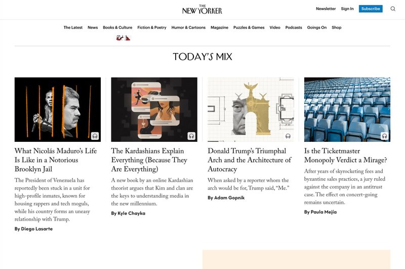
The New Yorker
Serif discipline, measured scale, restraint.
衬线体克制、尺度精准、整体极简。
Principles 2 · 7 · 9
原则 2 · 7 · 9
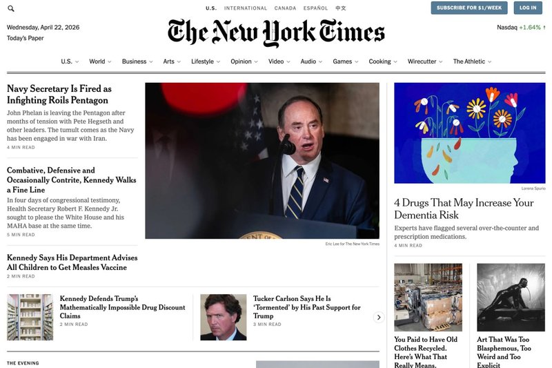
NYT Magazine
Display typography at scale; photo–type integration.
展示性字体的大尺度运用;图文整合。
Principles 2 · 8 · 9
原则 2 · 8 · 9
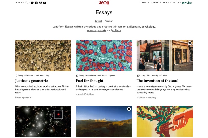
Aeon
Long-form web editorial; sustained measure across thousands of words.
长文网络编辑;几千字内始终保持行宽。
Principles 1 · 3 · 7
原则 1 · 3 · 7
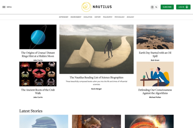
Nautilus
Illustrated science editorial; image–type integration.
带插图的科普编辑;图文一体。
Principles 6 · 8
原则 6 · 8
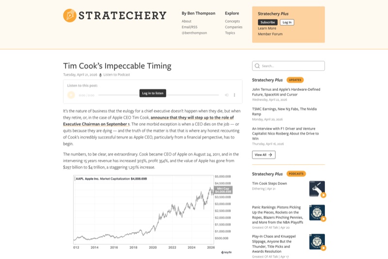
Stratechery
One face, one accent, disciplined hierarchy.
一种字体、一个强调色、自律的层级。
Principles 9 · 11
原则 9 · 11
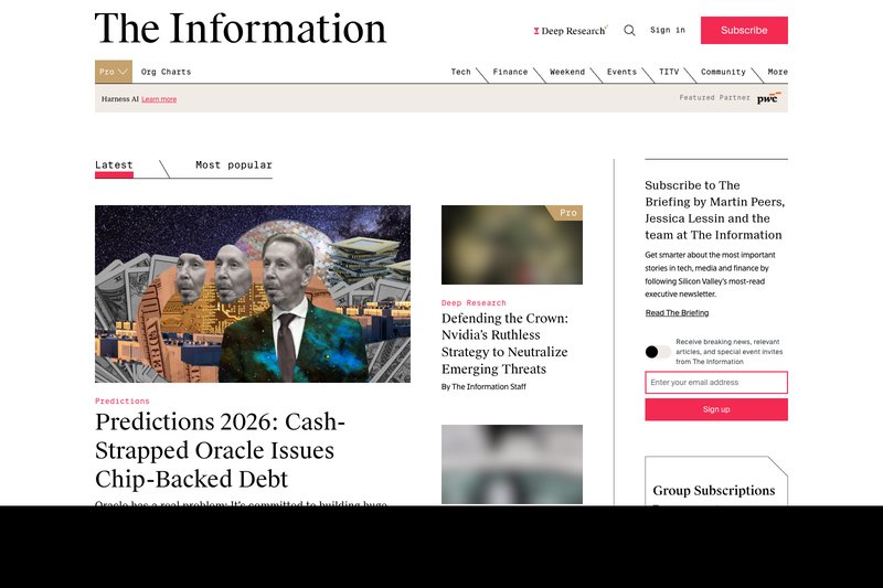
The Information
Dense investigative journalism in tight editorial structure.
密度很高的调查报道,编辑结构非常紧凑。
Principles 3 · 6 · 10
原则 3 · 6 · 10
📚 Canon
📚 经典书目
The short list. Each book has shaped the discipline and still rewards rereading.
精选书单。每一本都塑造过这门学科,今天重读仍有收获。
Canonical books
经典专著
- Robert Bringhurst, The Elements of Typographic Style. The modern bible of typography. If you read one book, read this one.
- Robert Bringhurst 《字体排印风格的要素》。现代字体排印学的"圣经"。如果只读一本,就读它。
- Josef Müller-Brockmann, Grid Systems in Graphic Design. The Swiss grid reference. Every two-column web layout is a reduction of this book.
- Josef Müller-Brockmann 《平面设计中的网格系统》。瑞士网格的标准参考。今天每一个两列网页布局都是它的简化版。
- Jan Tschichold, The New Typography / Designing Books. Page architecture, asymmetric balance, restraint.
- Jan Tschichold 《新字体排印》/《书籍设计》。页面结构、非对称平衡、克制之道。
- Ellen Lupton, Thinking With Type. Contemporary translation of Bringhurst for design school and web audiences. More accessible entry point.
- Ellen Lupton 《Thinking With Type》。面向设计院校和网页读者的 Bringhurst 现代版。入门更友好。
- Robin Williams, The Non-Designer's Design Book. The CRAP principles. The fastest weekend onboarding for anyone who has never thought about design.
- Robin Williams 《非设计师的设计书》。CRAP 四原则之源。从未系统想过"设计"的人,一个周末就能上手。
Online / free
免费在线资源
- Matthew Butterick, Practical Typography (practicaltypography.com). The most web-practical of the canon. Free.
- Matthew Butterick 《Practical Typography》(practicaltypography.com)。经典中最贴近网页实战的一本,免费。
- A List Apart archives (alistapart.com). Twenty-five years of web-editorial craft.
- A List Apart 档案(alistapart.com)。二十五年积累的网页编辑实战文章。
Further reading
延伸阅读
- Nathan Curtis, Design Tokens essays at eightshapes.com.
- Nathan Curtis 于 eightshapes.com 上关于 Design Tokens 的系列文章。
- The W3C Design Tokens Community Group.
- W3C Design Tokens 社区组。
- Any current issue of The New Yorker, NYT Magazine, or Stratechery — the living canon.
- 任何一期 New Yorker、NYT Magazine 或 Stratechery 最新号——活着的经典。
✦ How to practice
✦ 如何练习
Read the canon once. Then practice in public. Pick a piece of your own writing and set it at a 720px measure, one 14px body size, one display face, one accent color. Hold to that discipline for a week. Notice what you wanted to change and why. Most of what you wanted was decoration; the constraint made the typography work harder, and the writing better.
经典读一遍就够。然后就在公开场合练。挑一篇自己写的东西,把它排成 720px 行宽、14px 单一正文字号、一种展示字体、一个强调色。坚持一周。留意自己想改什么,为什么想改。多数"想改"其实是装饰冲动;约束让字体排印承担更多工作,顺带把写作也变好了。
Good editorial design is not about making the page beautiful. It is about making the reader stay. The thirteen principles above are the accumulated record of what makes readers stay — across letterpress, print, and the web. They are not rules to memorize; they are tools for seeing. Once you see them, you will notice when a page obeys them and when it does not — on the pages you design and on every page you read.
好的编辑设计不是为了把页面弄漂亮,而是为了让读者留下。上面十三条原则,是过去几个世纪里"让读者愿意留下"这件事积累下来的经验——从活字、印刷一路到网页。它们不是要你背的规条,而是用来看的工具。一旦你看到了它们,以后每一页,无论是你设计的还是你读到的,你都能一眼看出它有没有守住。